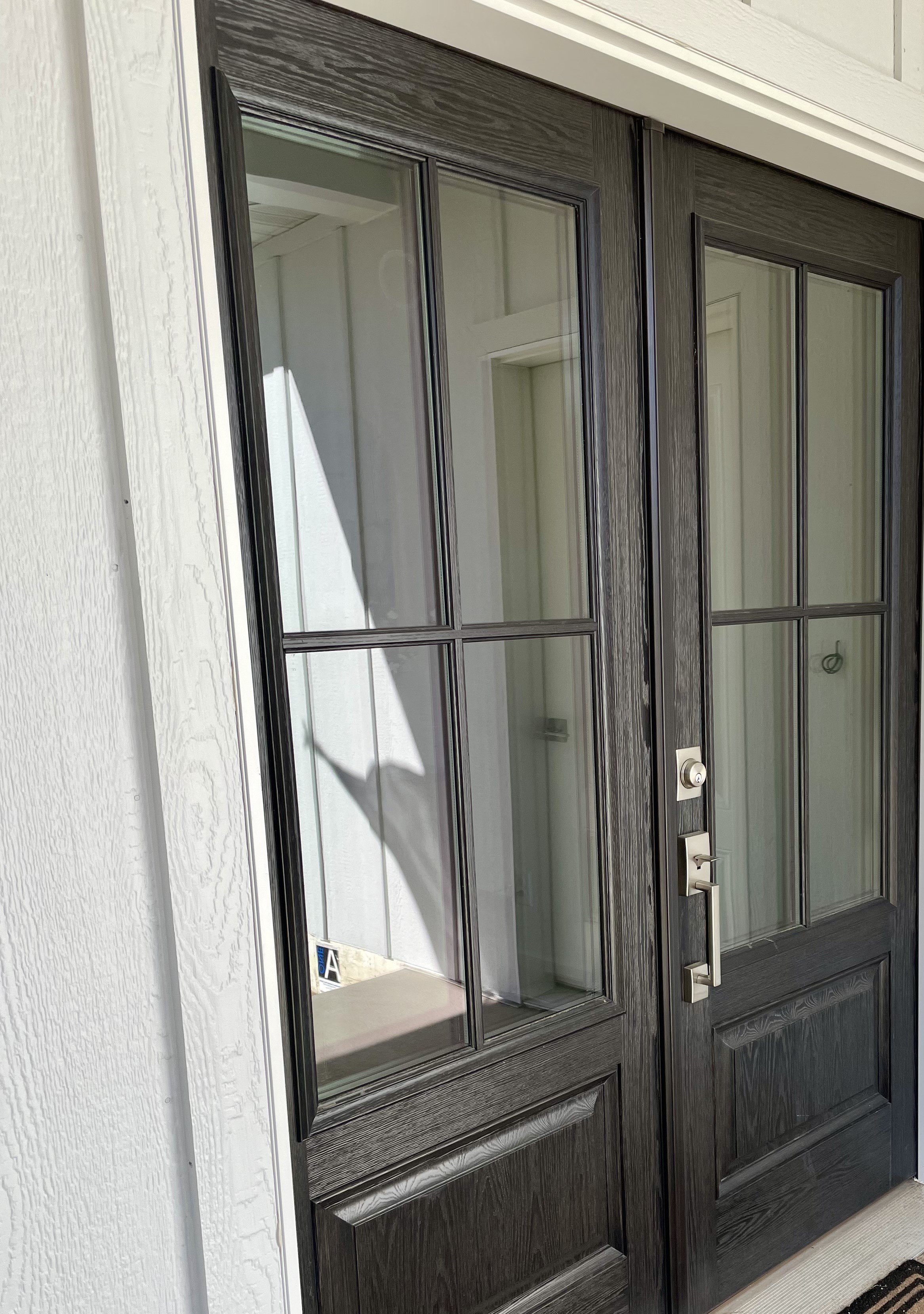
Building Our Dream Home/Part Two-Designing the Exterior
When we first started designing our dream home years ago, our vision was just a bit different. Believe it or not this neutral design girl wanted color on the exterior of our home. Back then I was MADLY in love with the color blue and I was determined to find just the right shade.
Fast forward to about two years ago when we toured some design homes and my heart went pitter-patter over the third one we walked up to.
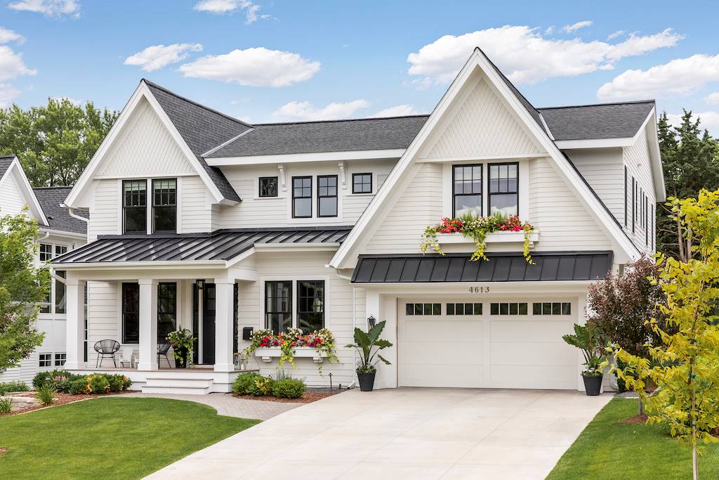
There was just something about that simple yet classic look that had me doing a complete 180 and rethinking how I wanted the exterior of our home to look.
So back to the drawing board, we went.
THE SIDING
Okay, so now we had decided on what color our exterior was going to be it was time to get down to the details. #1 was what type of siding we were going to use.
Since I’m more about the design than the nuts and bolts of the home, we both decided this was something Michael could do some research on.
How we Chose Out siding:
The #1 thing we were looking for in a siding was durability. We live in SE Minnesota and the weather here can be brutal at times year round. In the Spring the wind can reach up to 50 miles per hour, and in the summer it’s SUPER humid. Winter, of course, has been pretty mild the last couple of years, but it can get bitterly cold.
So the siding we chose had to be:
- Weather resistant
- Moisture and rot-resistant
- Pest-resistant ( IE: Squirrels)
Secondly, we wanted something maintenance-free. Neither one of us wanted to have to re-paint or replace the siding. At least not in the near future.
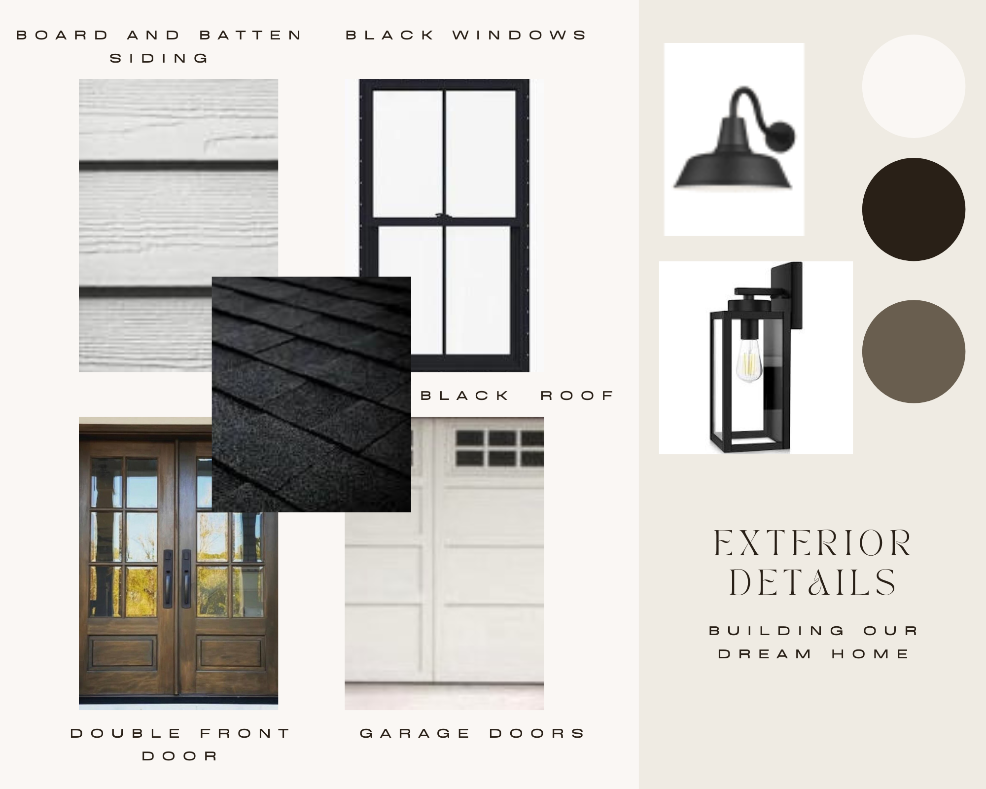
After much research on Michael’s part, we finally decided on a product that met all of our requirements.LP Smart Siding.
It ended up being a bit more expensive than some of our other choices but we felt it was one thing we didn’t want to skimp on.
THE ROOF:
Another item we didn’t want to skimp on was the roof. Again, weather resistance was a BIG one on our list, but also warranty, cost, and yes, aesthetically pleasing.
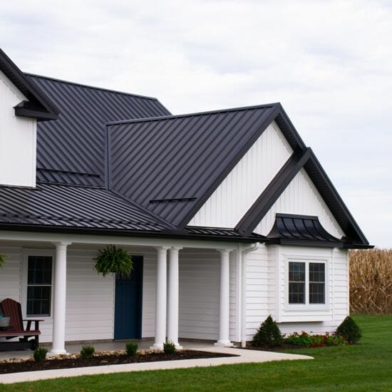
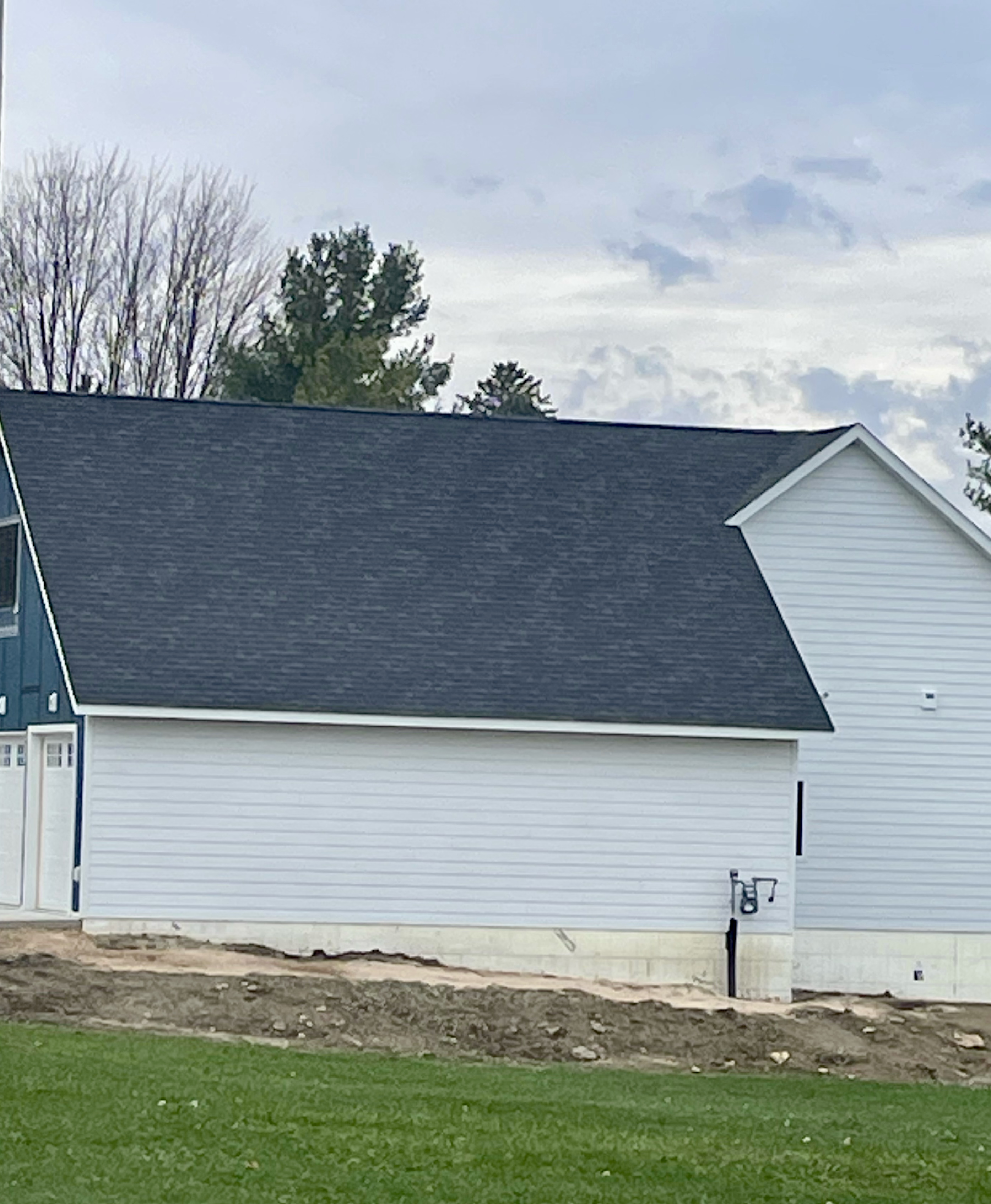
Many homes in our area are going with metal roofing. And while there is absolutely nothing wrong with it and it met every requirement we had, it didn’t meet one for me. Aesthetically pleasing. I’m sorry, even though our contractor HIGHLY recommended it, I just couldn’t see it in my vision of how I wanted our house to look. It was also a LOT more pricey than some of the other options, so in the end, we went with a 30-year roof from Timberline in the color charcoal.
It looks a bit darker in real life and we absolutely love how it contrasts against the white siding.
GARAGE DOORS:
For some people, garage doors would be the last on the list of important items for their exterior design. Not for me. In fact, it became one of the MOST important when after our plan was put onto paper, they took up a LOT of real estate in our front elevation.
So for that very reason, aesthetically pleasing became #1 on my list.
Not so for Michael. The garage was a VERY important part of our dream home for him. It’s something he’s been waiting for a very long time to have just the way he wanted it. In this case, size did matter.
Initially, we had looked at adjusting our house plan to make it L-shaped, with the garage off to one side.
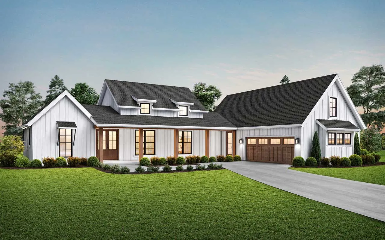
Unfortunately, when we walked that design off on our property it didn’t meet our town’s right-away policy so we had to go back to the drawing board once more.
There was no denying that the garage was going to take up a great deal of our front elevation. But I was willing to compromise a bit as long as the garage looked like it was ‘part’ of the house and not just a place you parked your car.
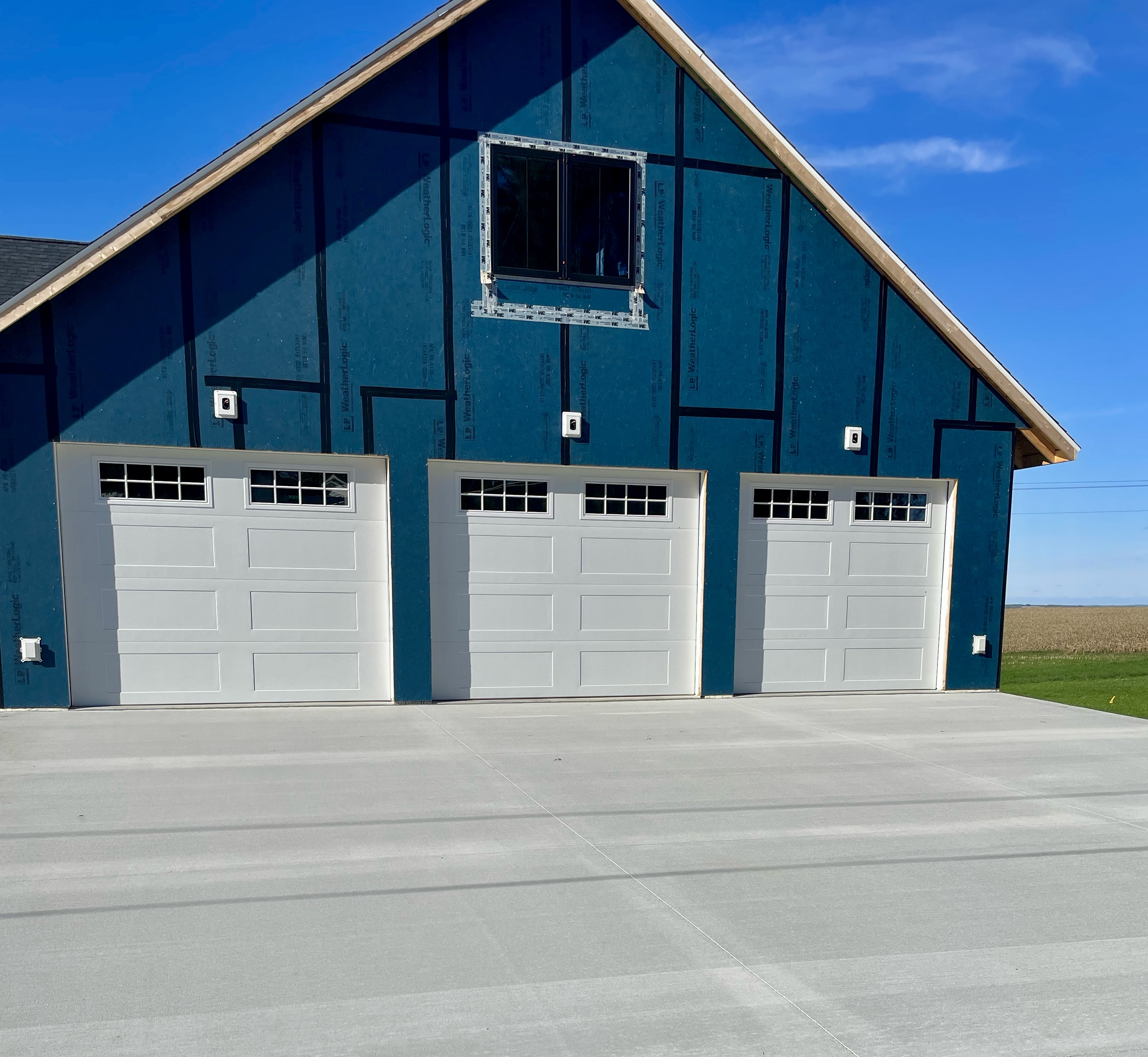
The doors were an important part of that. We chose quality doors from Overhead Doors with excellent insulation for those cold winter nights. But we also chose a different style than our original plans. Not that there was anything wrong with that rustic style, but it just didn’t fit with the modern look I wanted. We finally decided on their courtyard series with 16 windows. But the aesthetic appeal of our garage didn’t end there.
All the pieces of the design puzzle had to fit. In our original plan, the garage did not have a loft area but that ended up being one of our must-haves for storage. We also decided to add more character to the garage by putting board and batten on as well as adding a window not only for aesthetic appeal but also to add light in the loft area. Which brings me to…
WINDOWS:
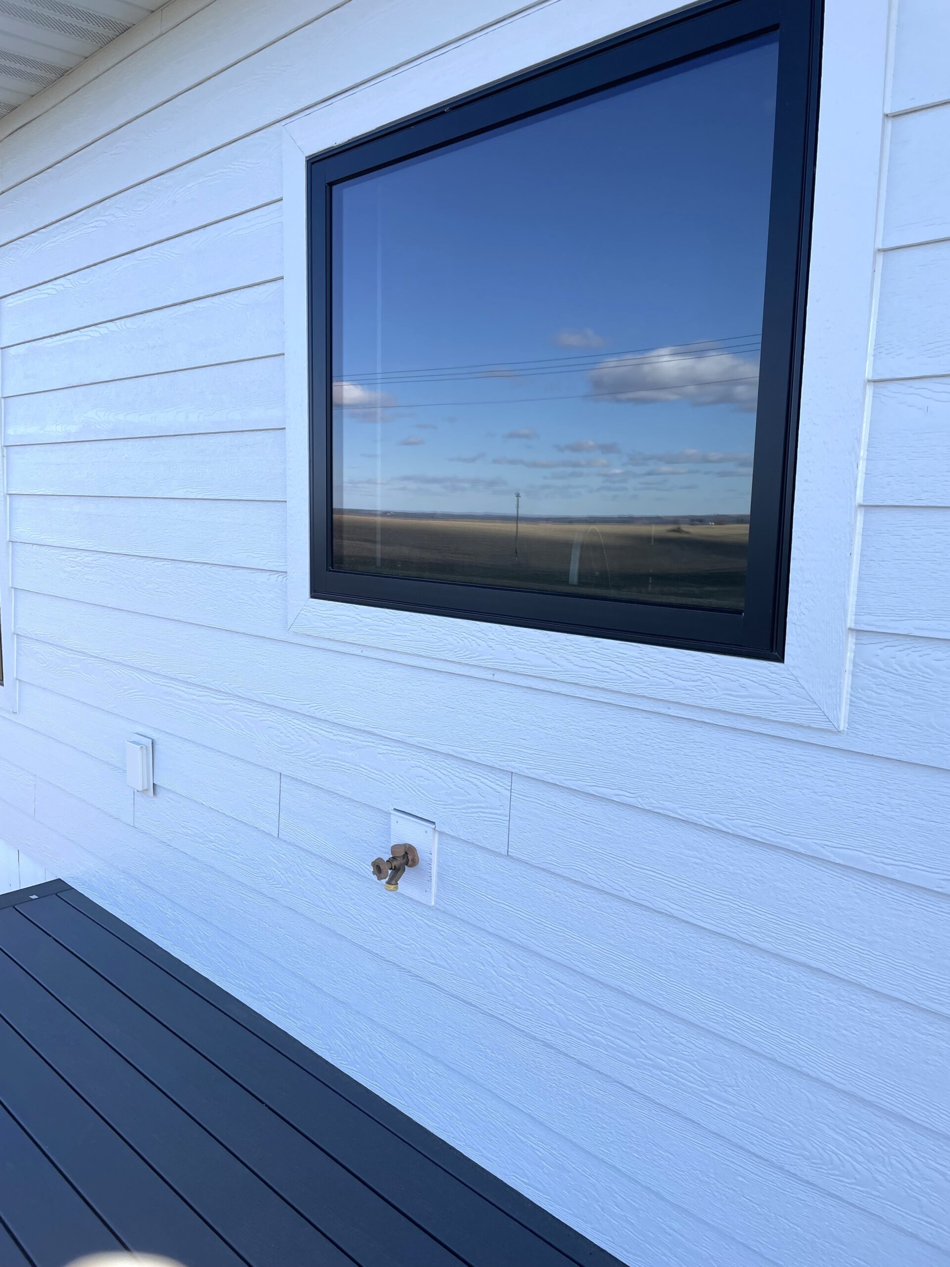
Why black windows? It was one of the first questions our friends and family asked after they saw the house. Black windows ARE more expensive. We knew that going in. They were also not as easy to get or as quickly as white. But we didn’t let any of that keep us from choosing them as a main part of our exterior (and interior) design.
There was never any other choice as far as I was concerned.
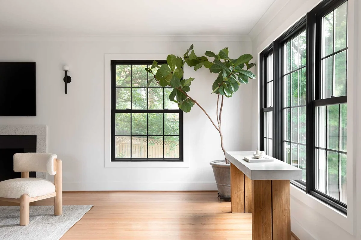
The contrast between the black windows and white siding was like icing on a cake. It just added that ‘extra’ something that you might not need but definitely want!
Windows are a BIG investment and they were one of the most costly materials we purchased for the house. The main reason again is the weather. We wanted a quality window that was energy-efficient and also functional and easy to clean. We chose Marvin Windows mainly because our GC recommended them, but we also liked their large selection of doors and windows.
Our choice for windows was their Elevate casement windows-and we did an awning window in our kitchen. We also chose them for our patio door. (I’ll be sharing more on that when we get to the interior)
THE FRONT DOOR:
Ever since I can remember, I’ve always wanted a double front door. After pricing them and realizing they were double if not triple the cost of a standard door, I almost changed my mind. But in the end, we splurged and we are BOTH so happy we did!
If the windows were the icing on the cake, this door was the cherry on top! I seriously cannot wait to start decorating it every season with not one but TWO wreaths!
LIGHTING:
The last and final piece of our exterior design puzzle was lighting. We plan to spend a lot of time on our front porch, so it was important to add the perfect ambient lighting for entertaining. We chose a simple modern wall lantern by the front door, some pot lights on a dimmer switch in the ceiling, along with a large fan for warm summer nights.
The back deck area has two modern lanterns on either side of the patio door, and for the garage, we decided on large gooseneck barn lights over each door.
I cannot even express to you in words how amazing it was the very first time we drove up to the house after the exterior had been completed. It made me realize just how important all the time and effort we put into planning the design really was. Seeing it all come together just as we had envisioned it was just incredible.
I’ll be sharing more photos of the exterior in another post, so be sure to check back in for those!
Coming up… Designing the Interior!
I can’t wait to share it all with you!

